Content
7 Top Design Document Examples to Model in 2025
7 Top Design Document Examples to Model in 2025
July 16, 2025

In today's fast-paced development cycles, clear, comprehensive documentation isn't just a formality-it's the critical blueprint that separates successful projects from those that lose their way. A well-crafted design document aligns teams, clarifies objectives, and mitigates risks before a single line of code is written or a pixel is placed. But what does a great one actually look like? To answer that, we've gathered and analyzed seven standout design document examples from tech leaders like Google, Apple, and Atlassian.
This isn't just a gallery of documents. We will break down their structures, reveal the strategic thinking behind them, and provide actionable takeaways you can apply immediately. This will help you streamline your own project documentation and build on a solid foundation. While this article focuses on high-level design, exploring related resources like great code documentation examples can provide complementary insights into effective technical communication at the implementation level.
From Google's famous Product Requirements Document (PRD) template to Airbnb's sophisticated Design Language System, we will dissect what makes these examples so effective. You'll leave with a clear understanding of how to build documents that drive clarity, consensus, and project success.
1. Google's PRD (Product Requirements Document) Template
Kicking off our list of premier design document examples is the Product Requirements Document (PRD) template popularized by Google. This isn't just a document; it's a strategic framework that has guided the development of features for products like Google Search, YouTube, and Android. It serves as a single source of truth, aligning product managers, engineers, designers, and marketing teams around a unified vision.
The Google PRD method forces teams to articulate the "why" before the "what." It begins with a clear problem statement and user-focused goals, ensuring every proposed feature is tied directly to user needs and business objectives. This structure prevents scope creep and keeps the entire development process anchored to its core purpose.
Strategic Analysis
The power of this template lies in its comprehensive, data-first approach. It demands that product managers support every assumption with evidence, whether from user research, market analysis, or A/B testing data.
Key Takeaway: The PRD acts as a formal contract between teams. By requiring sign-offs from key stakeholders, it ensures everyone agrees on the objectives, scope, and success metrics before significant engineering resources are committed.
This structured approach minimizes ambiguity and streamlines communication. For example, by including detailed user stories and "non-goals" (what the product will not do), the PRD provides absolute clarity for the engineering team, reducing back-and-forth and accelerating development cycles.
Actionable Insights
To effectively implement Google’s PRD approach, focus on these core components:
Executive Summary: Start with a concise overview to give stakeholders the essential information upfront.
User Stories: Frame requirements from the user's perspective to maintain a user-centric focus.
Success Metrics: Define how you will measure success before development begins. This ensures every feature is measurable and contributes to larger goals.
The infographic below highlights the key pillars that make a PRD a robust planning tool, focusing on prioritization, measurement, and execution.
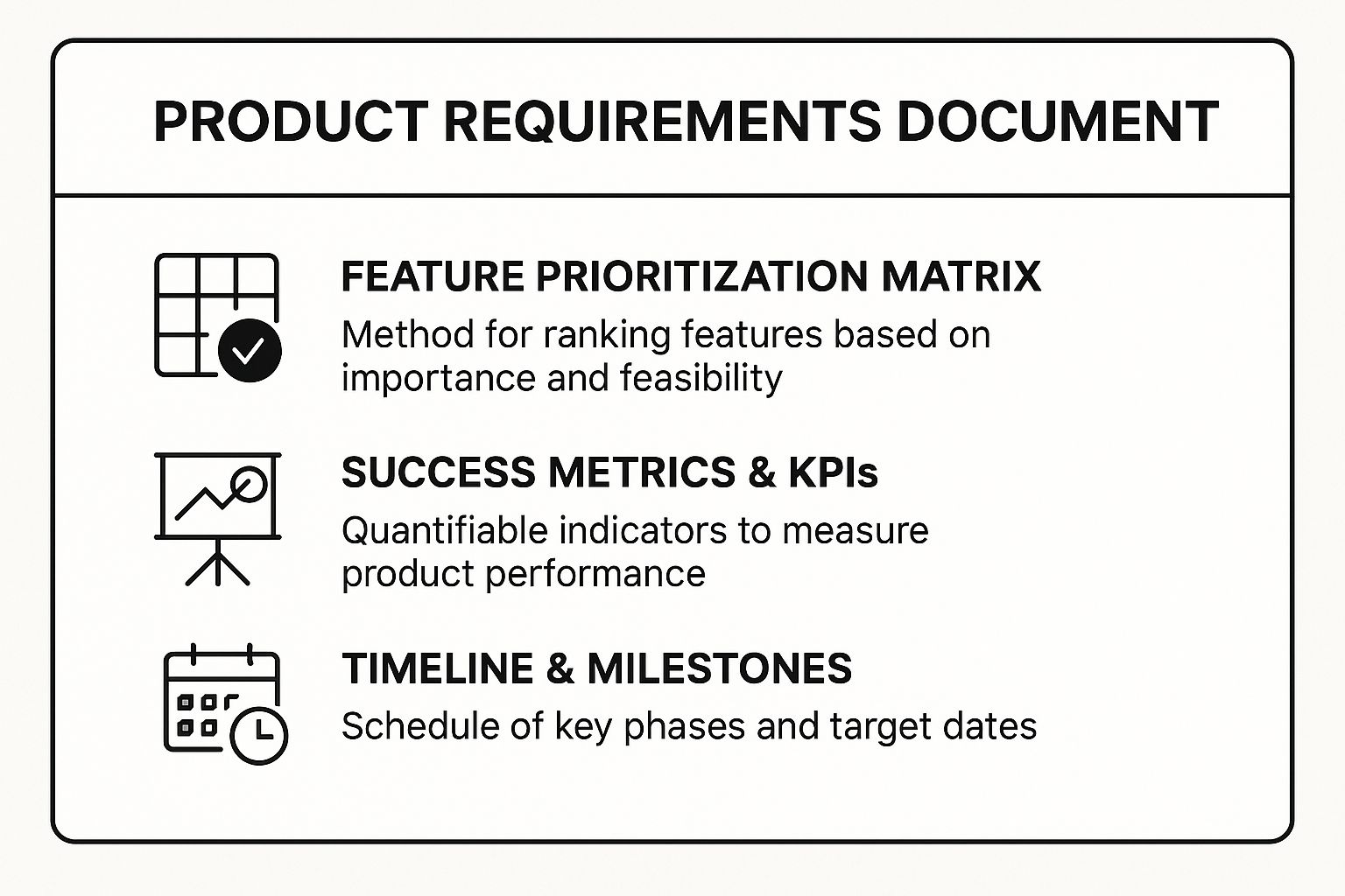
This visual summary reinforces that a successful PRD balances strategic feature selection with concrete metrics and a clear roadmap for delivery. For a deeper dive into structuring these documents, you can explore comprehensive guides on how a software requirements document template is constructed.
2. Apple's Human Interface Guidelines (HIG) Documentation
Next on our list of premier design document examples is Apple's Human Interface Guidelines (HIG). Far more than a simple style guide, the HIG is a comprehensive design system that codifies the principles of clarity, deference, and depth. It's the foundational framework that ensures intuitive, consistent, and aesthetically pleasing user experiences across Apple's entire ecosystem, including iOS, macOS, watchOS, and tvOS.

The HIG operates as a living document, evolving with each new hardware and software release. It provides designers and developers with a shared language and a detailed set of standards, from foundational layout grids and typography to complex animation patterns and accessibility requirements. This ensures that third-party apps, like the ones you find on the App Store, feel like a natural extension of the core operating system.
Strategic Analysis
The strategic genius of the HIG lies in its ability to balance prescription with flexibility. It establishes a strong, recognizable platform identity while leaving room for brands to express their unique character. The guidelines are rooted in a deep understanding of human-computer interaction, prioritizing usability and function over fleeting design trends.
Key Takeaway: The HIG is a tool for strategic alignment with a platform’s user expectations. By adhering to its principles, developers reduce the user's cognitive load, as interactions, gestures, and visual cues are already familiar. This builds immediate trust and accelerates user adoption.
This approach is evident in how the HIG details platform-specific considerations. For example, it defines distinct interaction patterns for a large Mac display versus a small Apple Watch screen, ensuring optimal usability in every context. By providing ready-to-use components and templates, it streamlines the design process, allowing teams to focus on their app's unique value proposition instead of reinventing the wheel.
Actionable Insights
To leverage Apple's HIG documentation effectively, design teams should focus on these core practices:
Start with Platform Foundations: Before designing custom elements, master the fundamental guidelines for the target platform (iOS, macOS, etc.) to ensure your app feels native.
Use Apple's Design Resources: Download and use the official UI kits, templates, and fonts provided by Apple to guarantee precision and consistency.
Prioritize Accessibility: Test your designs with features like VoiceOver and Dynamic Type enabled from the start. The HIG provides robust guidance for creating inclusive experiences.
By following the HIG, you are not just creating an app; you are contributing to a cohesive and predictable user environment. This makes the HIG an essential design document example for anyone developing for Apple platforms. For a comprehensive overview, you can explore Apple's official HIG website.
3. Atlassian's Software Architecture Document (SAD)
Next in our lineup of essential design document examples is the Software Architecture Document (SAD), championed by Atlassian. This technical blueprint is the backbone for complex systems like Jira, Confluence, and Bitbucket, providing a high-level overview of a system’s structure, components, and interactions. It serves as a critical communication tool, ensuring engineering teams share a common understanding of the technical landscape.
Atlassian’s approach to the SAD emphasizes clarity and practicality over rigid formalism. The document outlines key architectural decisions, rationales, and trade-offs, creating a durable reference for both current and future developers. It acts as the definitive guide for how the software is built, why it was built that way, and how it’s expected to evolve.
Strategic Analysis
The strategic value of an Atlassian-style SAD is its role as a living document that bridges the gap between high-level architectural vision and day-to-day implementation. It forces teams to document not just the final design, but also the "why" behind their choices, including constraints and discarded alternatives.
Key Takeaway: The SAD functions as a technical contract that aligns engineers on non-functional requirements like scalability, performance, and security. It systematically documents technical debt and outlines future improvements, making it a proactive tool for managing system health.
This documentation is crucial for onboarding new team members and maintaining architectural integrity as the system grows. By version-controlling the SAD alongside the codebase, as Atlassian advocates, the architecture remains synchronized with the software it describes, preventing the documentation from becoming obsolete.
Actionable Insights
To effectively create a SAD inspired by Atlassian’s methodology, integrate these key practices:
Use Diagrams: Illustrate complex system relationships with clear diagrams, providing both high-level views (context diagrams) and detailed views (component diagrams).
Document Decisions: Create an "Architectural Decision Record" (ADR) section to log significant choices, their context, and their consequences.
Conduct Regular Reviews: Treat the SAD as an active part of the development lifecycle by holding regular architecture review meetings with the team.
By following this approach, you can create a robust architectural guide that empowers your team to build and maintain complex software with confidence. For more guidance, you can find a comprehensive software documentation template that breaks down these components further.
4. Airbnb's Design Language System (DLS) Documentation
Next on our list of influential design document examples is Airbnb's Design Language System (DLS). Far more than a simple style guide, the DLS is a unified system that standardizes visual design, interaction patterns, and coded components across Airbnb’s entire digital ecosystem. Popularized by former design leaders like Alex Schleifer and Katie Dill, it acts as a central source of truth for creating cohesive, high-quality user experiences at scale.
The DLS was born out of necessity as Airbnb grew, facing fragmented user experiences across its web and mobile platforms. By creating a shared library of reusable components and clear guidelines, Airbnb enabled designers and engineers to build new features faster and more consistently. The system ensures that everything from the host onboarding flow to guest booking optimizations feels like part of a single, intuitive product.
Strategic Analysis
The strategic genius of Airbnb's DLS lies in its integration of design principles directly into the development workflow. It isn't just a PDF of rules; it’s a living library of code-backed components that are continuously updated. This operational approach bridges the gap between design and engineering, making consistency the path of least resistance.
Key Takeaway: The DLS is successful because it is treated as a product, not a side project. It has a dedicated team, a clear governance process, and a roadmap for evolution, ensuring it remains relevant and widely adopted across the organization.
This structured system allows teams to focus on solving complex user problems rather than reinventing basic interface elements. For instance, when designing the premium Airbnb Plus listings, teams could leverage existing DLS components for layout, typography, and buttons, freeing them to concentrate on the unique visual and functional requirements of the new tier.
Actionable Insights
To replicate the success of Airbnb’s DLS documentation, teams should prioritize the following:
Start with Core Components: Begin by defining fundamental elements like color, typography, and buttons before tackling more complex components.
Establish Clear Governance: Create a formal process for proposing, reviewing, and implementing new components or updates to the system.
Create Tools for Adoption: Build plugins for design software (like Figma) and packages for code repositories to make it easy for teams to use the system.
This approach ensures that your design system is not just a reference but a practical, integrated tool that accelerates production. For those looking to implement similar systems, exploring how other companies structure their design documentation can provide further valuable insights.
5. Spotify's Technical Design Document (TDD)
Next in our lineup of powerful design document examples is the Technical Design Document (TDD) model championed by Spotify. This document is the engineering counterpart to a product requirements document, translating the "what" and "why" into a concrete "how." It's an essential tool for navigating the complexities of building and scaling systems that serve hundreds of millions of users, from playlist algorithms to audio streaming infrastructure.
The Spotify TDD approach is built on a culture of technical rigor and collaborative problem-solving. It compels engineers to thoroughly investigate a problem, explore multiple potential solutions, and justify their chosen path with data and logical reasoning. This process ensures that architectural decisions are deliberate, scalable, and well understood across engineering squads.
Strategic Analysis
The strength of Spotify's TDD lies in its focus on de-risking implementation before a single line of code is written. It forces teams to confront hard questions early, such as system dependencies, performance bottlenecks, and operational costs. It’s a blueprint for execution that aligns backend, frontend, and platform engineers on a unified technical strategy.
Key Takeaway: The TDD is a living document for exploring trade-offs. By documenting alternative solutions and the reasons they were rejected, it creates an invaluable record of the decision-making process that informs future architectural choices.
This methodology prevents engineers from defaulting to familiar but suboptimal solutions. For instance, when improving the music recommendation engine, a TDD would detail the current system's limitations, propose several new models (e.g., collaborative filtering vs. deep learning), and benchmark their potential impact on user engagement and infrastructure load.
Actionable Insights
To apply Spotify's TDD framework effectively in your own projects, concentrate on these foundational components:
Problem Context: Clearly define the technical problem you are solving and its connection to user or business goals.
Proposed Solutions: Detail at least two or three viable technical approaches. For each, analyze its pros, cons, and potential risks.
Implementation Plan: Outline the chosen solution with clear milestones, required resources, and dependencies. Include considerations for testing, deployment, and monitoring.
By structuring technical planning this way, the TDD becomes more than just a specification; it’s a critical thinking tool that elevates the quality and resilience of the final product. It ensures every technical decision is defensible, transparent, and aligned with long-term goals.
6. Microsoft's Functional Specification Document
Another heavyweight among design document examples is the Functional Specification Document, or "functional spec," a methodology perfected and championed by Microsoft. This document provides an exhaustive description of a product’s features and capabilities from the user’s perspective. It has been instrumental in the development of massive software systems like the Windows operating system, Microsoft Office, and Azure cloud services.
The Microsoft functional spec acts as the definitive guide for what the software will do. It translates high-level product requirements into detailed functional requirements that engineers, testers, and program managers can use to build and validate the product. It focuses on the "what" and "how" from a user interaction standpoint, leaving the technical implementation details for a separate technical specification.
Strategic Analysis
The strength of this approach is its relentless emphasis on clarity and completeness. By detailing every user-facing function, including user scenarios, interface mockups, and error handling, the document leaves little room for interpretation. This was famously advocated by former Microsoft Program Manager Joel Spolsky, who saw it as a critical tool for building complex software without chaos.
Key Takeaway: The functional spec serves as a blueprint for the user experience. By forcing teams to think through every possible user interaction and edge case upfront, it significantly reduces ambiguity and costly rework during the development and QA phases.
This exhaustive documentation ensures alignment across large, often distributed teams. For example, by specifying both positive and negative test scenarios, the functional spec gives the QA team a clear checklist to work from, ensuring that features like those in Microsoft Teams are robust and reliable upon release.
Actionable Insights
To successfully adopt Microsoft’s functional spec methodology, prioritize these components:
User Scenarios: Detail step-by-step descriptions of how users will interact with each feature to accomplish their goals.
Feature Definitions: Provide a comprehensive breakdown of every feature, including its purpose, scope, and user-facing behavior.
Visual Mockups: Use wireframes or mockups to visually communicate the user interface, making requirements easier to understand and validate.
The functional spec is a powerful tool for ensuring that complex software meets both user needs and business requirements with precision. To explore the nuances of this type of documentation, you can discover more about how to write technical specifications and its core principles.
7. Basecamp's Shape Up Design Document
Diverging from traditional, exhaustive specification documents, Basecamp's "Shape Up" method offers a lightweight and agile alternative. This framework, developed and championed by the team behind products like Basecamp and HEY, prioritizes problem-solving and high-level solution shaping over granular, upfront feature lists. It is one of the most practical design document examples for teams looking to move faster and with more autonomy.
The Shape Up approach centers on "shaping" work into well-defined but flexible project pitches. These pitches define the core problem, establish an "appetite" (a fixed time budget, like six weeks), and outline the solution's boundaries, not its exact implementation. This empowers a small, dedicated team to figure out the best way to build the feature within the given constraints.
Strategic Analysis
The genius of this method is its built-in risk management and focus. By capping the time investment (appetite), it forces teams to make pragmatic trade-offs and avoid "rabbit holes" or endless scope creep. The documents are deliberately kept rough and abstract, encouraging iteration and creative problem-solving from the development team.
Key Takeaway: The Shape Up document is not a binding contract for features; it's a bet on a team's ability to deliver a valuable solution within a fixed timeframe. It decouples planning from execution, giving builders the freedom to make implementation decisions.
This structure is particularly effective for improving existing products, as seen in Basecamp's own mobile app enhancements and new feature rollouts. It ensures that effort is concentrated on solving a specific problem without getting bogged down in pre-specified details that might become irrelevant once development begins.
Actionable Insights
To apply the Shape Up methodology, your design document should focus on these principles:
Define the Problem First: Clearly articulate the user problem you are solving before sketching any solutions. This keeps the work grounded in user value.
Set a Fixed Appetite: Instead of estimating, set a fixed time budget. This constraint drives focus and forces prioritization of what's truly essential.
Identify "No-Go" Zones: Explicitly state what is out of scope. This helps prevent detours and keeps the project on track by defining clear boundaries.
By keeping initial sketches rough and focusing on core concepts rather than polished UI, you empower the build team. This approach is less about documentation and more about creating a shared understanding of the problem, the constraints, and the desired outcome.
Design Document Examples Comparison
Document / System | Implementation Complexity 🔄 | Resource Requirements ⚡ | Expected Outcomes 📊 | Ideal Use Cases 💡 | Key Advantages ⭐ |
|---|---|---|---|---|---|
Google's PRD (Product Requirements Document) | High – detailed, extensive sections, structured | High – significant upfront research and data | Clear stakeholder alignment, data-driven features | Large, scalable projects needing business & tech clarity | Well-tested, scalable, business + technical clarity |
Apple's Human Interface Guidelines (HIG) | Medium – comprehensive but platform-specific | Medium – ongoing updating, requires design skill | Consistent UX across Apple platforms | Designing intuitive apps in Apple ecosystem | Ensures consistency, accessibility, rich examples |
Atlassian's Software Architecture Document (SAD) | High – technical depth, diagrams, specifications | High – requires technical expertise | Clear architecture communication, maintainability | Complex systems requiring detailed architecture | Strong technical clarity, team onboarding focused |
Airbnb's Design Language System (DLS) | Medium-High – comprehensive design system | High – initial investment + ongoing maintenance | Rapid prototyping, brand consistency | Standardizing UI/UX across large-scale platforms | Facilitates collaboration, scalable, reduces dev time |
Spotify's Technical Design Document (TDD) | High – thorough problem and solution analysis | High – experienced technical writers needed | Transparent technical decisions, scalable solutions | Distributed, large-scale engineering problems | Strong problem analysis, supports autonomous teams |
Microsoft's Functional Specification Document | Medium-High – detailed feature and scenario focus | Medium-High – extensive writing and review cycles | Comprehensive requirements, reduces scope creep | Waterfall/hybrid projects with clear feature specs | Detailed coverage, strong stakeholder communication |
Basecamp's Shape Up Design Document | Low-Medium – lightweight, problem-solution focus | Low – minimal documentation, focus on key points | Rapid problem solving, focused solution delivery | Small to medium teams, agile-friendly environments | Prevents over-engineering, encourages creativity |
Turn Your Ideas Into Polished Documents, Faster
We've explored a powerful collection of real-world design document examples, from Google’s exhaustive Product Requirements Documents to Basecamp’s lean and agile Shape Up pitches. The journey from Apple's iconic Human Interface Guidelines to Spotify's detailed Technical Design Documents reveals a critical truth: there is no one-size-fits-all solution. The most effective document is the one that best serves its specific purpose, audience, and project context.
The common thread woven through these successful examples is a relentless focus on clarity, communication, and alignment. Whether you're defining user-facing experiences like Apple and Airbnb or detailing backend architecture like Atlassian and Spotify, the goal remains the same: to create a single source of truth that empowers your team to build the right thing, the right way.
From Inspiration to Implementation
So, how do you translate the inspiration from these industry-leading examples into your own daily workflow? The key is to move beyond simply copying a format and instead internalize the underlying principles.
Adapt, Don't Just Adopt: Instead of blindly adopting Google's entire PRD template, ask yourself which sections truly serve your project. Perhaps a hybrid of Microsoft's functional specs and Basecamp's problem framing is the perfect fit for your next feature.
Prioritize Purpose Over Pomp: A design document's value is not measured by its length but by its utility. A concise, well-articulated document that gets read and used is infinitely more valuable than a comprehensive tome that gathers digital dust.
Make It a Living Document: As we saw with Atlassian's approach, the best documents evolve. Treat them as dynamic resources that adapt to new information, feedback, and technical discoveries, ensuring they remain relevant throughout the project lifecycle.
Mastering the art of creating effective documentation is a strategic advantage. It reduces ambiguity, minimizes costly rework, and accelerates the entire development process. The design document examples we've analyzed are not just templates; they are blueprints for successful collaboration and execution. By applying these strategic insights, you can transform your own documentation process from a procedural chore into a powerful tool for innovation.
To further accelerate the creation of your design documents, consider utilizing specialized design document template software. These tools can provide structured starting points and streamline the process, allowing you to focus more on the strategic content and less on the formatting. Ultimately, your goal is to build a documentation culture that is as efficient and intentional as the products you aim to create.
Ready to eliminate the friction between your ideas and the page? VoiceType AI helps you draft comprehensive design documents, technical specs, and project plans up to 9x faster using just your voice. Transform your spoken thoughts into perfectly formatted text, so you can focus on strategic problem-solving, not tedious typing. Try VoiceType AI for free today and start creating better documents in a fraction of the time.
In today's fast-paced development cycles, clear, comprehensive documentation isn't just a formality-it's the critical blueprint that separates successful projects from those that lose their way. A well-crafted design document aligns teams, clarifies objectives, and mitigates risks before a single line of code is written or a pixel is placed. But what does a great one actually look like? To answer that, we've gathered and analyzed seven standout design document examples from tech leaders like Google, Apple, and Atlassian.
This isn't just a gallery of documents. We will break down their structures, reveal the strategic thinking behind them, and provide actionable takeaways you can apply immediately. This will help you streamline your own project documentation and build on a solid foundation. While this article focuses on high-level design, exploring related resources like great code documentation examples can provide complementary insights into effective technical communication at the implementation level.
From Google's famous Product Requirements Document (PRD) template to Airbnb's sophisticated Design Language System, we will dissect what makes these examples so effective. You'll leave with a clear understanding of how to build documents that drive clarity, consensus, and project success.
1. Google's PRD (Product Requirements Document) Template
Kicking off our list of premier design document examples is the Product Requirements Document (PRD) template popularized by Google. This isn't just a document; it's a strategic framework that has guided the development of features for products like Google Search, YouTube, and Android. It serves as a single source of truth, aligning product managers, engineers, designers, and marketing teams around a unified vision.
The Google PRD method forces teams to articulate the "why" before the "what." It begins with a clear problem statement and user-focused goals, ensuring every proposed feature is tied directly to user needs and business objectives. This structure prevents scope creep and keeps the entire development process anchored to its core purpose.
Strategic Analysis
The power of this template lies in its comprehensive, data-first approach. It demands that product managers support every assumption with evidence, whether from user research, market analysis, or A/B testing data.
Key Takeaway: The PRD acts as a formal contract between teams. By requiring sign-offs from key stakeholders, it ensures everyone agrees on the objectives, scope, and success metrics before significant engineering resources are committed.
This structured approach minimizes ambiguity and streamlines communication. For example, by including detailed user stories and "non-goals" (what the product will not do), the PRD provides absolute clarity for the engineering team, reducing back-and-forth and accelerating development cycles.
Actionable Insights
To effectively implement Google’s PRD approach, focus on these core components:
Executive Summary: Start with a concise overview to give stakeholders the essential information upfront.
User Stories: Frame requirements from the user's perspective to maintain a user-centric focus.
Success Metrics: Define how you will measure success before development begins. This ensures every feature is measurable and contributes to larger goals.
The infographic below highlights the key pillars that make a PRD a robust planning tool, focusing on prioritization, measurement, and execution.
This visual summary reinforces that a successful PRD balances strategic feature selection with concrete metrics and a clear roadmap for delivery. For a deeper dive into structuring these documents, you can explore comprehensive guides on how a software requirements document template is constructed.
2. Apple's Human Interface Guidelines (HIG) Documentation
Next on our list of premier design document examples is Apple's Human Interface Guidelines (HIG). Far more than a simple style guide, the HIG is a comprehensive design system that codifies the principles of clarity, deference, and depth. It's the foundational framework that ensures intuitive, consistent, and aesthetically pleasing user experiences across Apple's entire ecosystem, including iOS, macOS, watchOS, and tvOS.
The HIG operates as a living document, evolving with each new hardware and software release. It provides designers and developers with a shared language and a detailed set of standards, from foundational layout grids and typography to complex animation patterns and accessibility requirements. This ensures that third-party apps, like the ones you find on the App Store, feel like a natural extension of the core operating system.
Strategic Analysis
The strategic genius of the HIG lies in its ability to balance prescription with flexibility. It establishes a strong, recognizable platform identity while leaving room for brands to express their unique character. The guidelines are rooted in a deep understanding of human-computer interaction, prioritizing usability and function over fleeting design trends.
Key Takeaway: The HIG is a tool for strategic alignment with a platform’s user expectations. By adhering to its principles, developers reduce the user's cognitive load, as interactions, gestures, and visual cues are already familiar. This builds immediate trust and accelerates user adoption.
This approach is evident in how the HIG details platform-specific considerations. For example, it defines distinct interaction patterns for a large Mac display versus a small Apple Watch screen, ensuring optimal usability in every context. By providing ready-to-use components and templates, it streamlines the design process, allowing teams to focus on their app's unique value proposition instead of reinventing the wheel.
Actionable Insights
To leverage Apple's HIG documentation effectively, design teams should focus on these core practices:
Start with Platform Foundations: Before designing custom elements, master the fundamental guidelines for the target platform (iOS, macOS, etc.) to ensure your app feels native.
Use Apple's Design Resources: Download and use the official UI kits, templates, and fonts provided by Apple to guarantee precision and consistency.
Prioritize Accessibility: Test your designs with features like VoiceOver and Dynamic Type enabled from the start. The HIG provides robust guidance for creating inclusive experiences.
By following the HIG, you are not just creating an app; you are contributing to a cohesive and predictable user environment. This makes the HIG an essential design document example for anyone developing for Apple platforms. For a comprehensive overview, you can explore Apple's official HIG website.
3. Atlassian's Software Architecture Document (SAD)
Next in our lineup of essential design document examples is the Software Architecture Document (SAD), championed by Atlassian. This technical blueprint is the backbone for complex systems like Jira, Confluence, and Bitbucket, providing a high-level overview of a system’s structure, components, and interactions. It serves as a critical communication tool, ensuring engineering teams share a common understanding of the technical landscape.
Atlassian’s approach to the SAD emphasizes clarity and practicality over rigid formalism. The document outlines key architectural decisions, rationales, and trade-offs, creating a durable reference for both current and future developers. It acts as the definitive guide for how the software is built, why it was built that way, and how it’s expected to evolve.
Strategic Analysis
The strategic value of an Atlassian-style SAD is its role as a living document that bridges the gap between high-level architectural vision and day-to-day implementation. It forces teams to document not just the final design, but also the "why" behind their choices, including constraints and discarded alternatives.
Key Takeaway: The SAD functions as a technical contract that aligns engineers on non-functional requirements like scalability, performance, and security. It systematically documents technical debt and outlines future improvements, making it a proactive tool for managing system health.
This documentation is crucial for onboarding new team members and maintaining architectural integrity as the system grows. By version-controlling the SAD alongside the codebase, as Atlassian advocates, the architecture remains synchronized with the software it describes, preventing the documentation from becoming obsolete.
Actionable Insights
To effectively create a SAD inspired by Atlassian’s methodology, integrate these key practices:
Use Diagrams: Illustrate complex system relationships with clear diagrams, providing both high-level views (context diagrams) and detailed views (component diagrams).
Document Decisions: Create an "Architectural Decision Record" (ADR) section to log significant choices, their context, and their consequences.
Conduct Regular Reviews: Treat the SAD as an active part of the development lifecycle by holding regular architecture review meetings with the team.
By following this approach, you can create a robust architectural guide that empowers your team to build and maintain complex software with confidence. For more guidance, you can find a comprehensive software documentation template that breaks down these components further.
4. Airbnb's Design Language System (DLS) Documentation
Next on our list of influential design document examples is Airbnb's Design Language System (DLS). Far more than a simple style guide, the DLS is a unified system that standardizes visual design, interaction patterns, and coded components across Airbnb’s entire digital ecosystem. Popularized by former design leaders like Alex Schleifer and Katie Dill, it acts as a central source of truth for creating cohesive, high-quality user experiences at scale.
The DLS was born out of necessity as Airbnb grew, facing fragmented user experiences across its web and mobile platforms. By creating a shared library of reusable components and clear guidelines, Airbnb enabled designers and engineers to build new features faster and more consistently. The system ensures that everything from the host onboarding flow to guest booking optimizations feels like part of a single, intuitive product.
Strategic Analysis
The strategic genius of Airbnb's DLS lies in its integration of design principles directly into the development workflow. It isn't just a PDF of rules; it’s a living library of code-backed components that are continuously updated. This operational approach bridges the gap between design and engineering, making consistency the path of least resistance.
Key Takeaway: The DLS is successful because it is treated as a product, not a side project. It has a dedicated team, a clear governance process, and a roadmap for evolution, ensuring it remains relevant and widely adopted across the organization.
This structured system allows teams to focus on solving complex user problems rather than reinventing basic interface elements. For instance, when designing the premium Airbnb Plus listings, teams could leverage existing DLS components for layout, typography, and buttons, freeing them to concentrate on the unique visual and functional requirements of the new tier.
Actionable Insights
To replicate the success of Airbnb’s DLS documentation, teams should prioritize the following:
Start with Core Components: Begin by defining fundamental elements like color, typography, and buttons before tackling more complex components.
Establish Clear Governance: Create a formal process for proposing, reviewing, and implementing new components or updates to the system.
Create Tools for Adoption: Build plugins for design software (like Figma) and packages for code repositories to make it easy for teams to use the system.
This approach ensures that your design system is not just a reference but a practical, integrated tool that accelerates production. For those looking to implement similar systems, exploring how other companies structure their design documentation can provide further valuable insights.
5. Spotify's Technical Design Document (TDD)
Next in our lineup of powerful design document examples is the Technical Design Document (TDD) model championed by Spotify. This document is the engineering counterpart to a product requirements document, translating the "what" and "why" into a concrete "how." It's an essential tool for navigating the complexities of building and scaling systems that serve hundreds of millions of users, from playlist algorithms to audio streaming infrastructure.
The Spotify TDD approach is built on a culture of technical rigor and collaborative problem-solving. It compels engineers to thoroughly investigate a problem, explore multiple potential solutions, and justify their chosen path with data and logical reasoning. This process ensures that architectural decisions are deliberate, scalable, and well understood across engineering squads.
Strategic Analysis
The strength of Spotify's TDD lies in its focus on de-risking implementation before a single line of code is written. It forces teams to confront hard questions early, such as system dependencies, performance bottlenecks, and operational costs. It’s a blueprint for execution that aligns backend, frontend, and platform engineers on a unified technical strategy.
Key Takeaway: The TDD is a living document for exploring trade-offs. By documenting alternative solutions and the reasons they were rejected, it creates an invaluable record of the decision-making process that informs future architectural choices.
This methodology prevents engineers from defaulting to familiar but suboptimal solutions. For instance, when improving the music recommendation engine, a TDD would detail the current system's limitations, propose several new models (e.g., collaborative filtering vs. deep learning), and benchmark their potential impact on user engagement and infrastructure load.
Actionable Insights
To apply Spotify's TDD framework effectively in your own projects, concentrate on these foundational components:
Problem Context: Clearly define the technical problem you are solving and its connection to user or business goals.
Proposed Solutions: Detail at least two or three viable technical approaches. For each, analyze its pros, cons, and potential risks.
Implementation Plan: Outline the chosen solution with clear milestones, required resources, and dependencies. Include considerations for testing, deployment, and monitoring.
By structuring technical planning this way, the TDD becomes more than just a specification; it’s a critical thinking tool that elevates the quality and resilience of the final product. It ensures every technical decision is defensible, transparent, and aligned with long-term goals.
6. Microsoft's Functional Specification Document
Another heavyweight among design document examples is the Functional Specification Document, or "functional spec," a methodology perfected and championed by Microsoft. This document provides an exhaustive description of a product’s features and capabilities from the user’s perspective. It has been instrumental in the development of massive software systems like the Windows operating system, Microsoft Office, and Azure cloud services.
The Microsoft functional spec acts as the definitive guide for what the software will do. It translates high-level product requirements into detailed functional requirements that engineers, testers, and program managers can use to build and validate the product. It focuses on the "what" and "how" from a user interaction standpoint, leaving the technical implementation details for a separate technical specification.
Strategic Analysis
The strength of this approach is its relentless emphasis on clarity and completeness. By detailing every user-facing function, including user scenarios, interface mockups, and error handling, the document leaves little room for interpretation. This was famously advocated by former Microsoft Program Manager Joel Spolsky, who saw it as a critical tool for building complex software without chaos.
Key Takeaway: The functional spec serves as a blueprint for the user experience. By forcing teams to think through every possible user interaction and edge case upfront, it significantly reduces ambiguity and costly rework during the development and QA phases.
This exhaustive documentation ensures alignment across large, often distributed teams. For example, by specifying both positive and negative test scenarios, the functional spec gives the QA team a clear checklist to work from, ensuring that features like those in Microsoft Teams are robust and reliable upon release.
Actionable Insights
To successfully adopt Microsoft’s functional spec methodology, prioritize these components:
User Scenarios: Detail step-by-step descriptions of how users will interact with each feature to accomplish their goals.
Feature Definitions: Provide a comprehensive breakdown of every feature, including its purpose, scope, and user-facing behavior.
Visual Mockups: Use wireframes or mockups to visually communicate the user interface, making requirements easier to understand and validate.
The functional spec is a powerful tool for ensuring that complex software meets both user needs and business requirements with precision. To explore the nuances of this type of documentation, you can discover more about how to write technical specifications and its core principles.
7. Basecamp's Shape Up Design Document
Diverging from traditional, exhaustive specification documents, Basecamp's "Shape Up" method offers a lightweight and agile alternative. This framework, developed and championed by the team behind products like Basecamp and HEY, prioritizes problem-solving and high-level solution shaping over granular, upfront feature lists. It is one of the most practical design document examples for teams looking to move faster and with more autonomy.
The Shape Up approach centers on "shaping" work into well-defined but flexible project pitches. These pitches define the core problem, establish an "appetite" (a fixed time budget, like six weeks), and outline the solution's boundaries, not its exact implementation. This empowers a small, dedicated team to figure out the best way to build the feature within the given constraints.
Strategic Analysis
The genius of this method is its built-in risk management and focus. By capping the time investment (appetite), it forces teams to make pragmatic trade-offs and avoid "rabbit holes" or endless scope creep. The documents are deliberately kept rough and abstract, encouraging iteration and creative problem-solving from the development team.
Key Takeaway: The Shape Up document is not a binding contract for features; it's a bet on a team's ability to deliver a valuable solution within a fixed timeframe. It decouples planning from execution, giving builders the freedom to make implementation decisions.
This structure is particularly effective for improving existing products, as seen in Basecamp's own mobile app enhancements and new feature rollouts. It ensures that effort is concentrated on solving a specific problem without getting bogged down in pre-specified details that might become irrelevant once development begins.
Actionable Insights
To apply the Shape Up methodology, your design document should focus on these principles:
Define the Problem First: Clearly articulate the user problem you are solving before sketching any solutions. This keeps the work grounded in user value.
Set a Fixed Appetite: Instead of estimating, set a fixed time budget. This constraint drives focus and forces prioritization of what's truly essential.
Identify "No-Go" Zones: Explicitly state what is out of scope. This helps prevent detours and keeps the project on track by defining clear boundaries.
By keeping initial sketches rough and focusing on core concepts rather than polished UI, you empower the build team. This approach is less about documentation and more about creating a shared understanding of the problem, the constraints, and the desired outcome.
Design Document Examples Comparison
Document / System | Implementation Complexity 🔄 | Resource Requirements ⚡ | Expected Outcomes 📊 | Ideal Use Cases 💡 | Key Advantages ⭐ |
|---|---|---|---|---|---|
Google's PRD (Product Requirements Document) | High – detailed, extensive sections, structured | High – significant upfront research and data | Clear stakeholder alignment, data-driven features | Large, scalable projects needing business & tech clarity | Well-tested, scalable, business + technical clarity |
Apple's Human Interface Guidelines (HIG) | Medium – comprehensive but platform-specific | Medium – ongoing updating, requires design skill | Consistent UX across Apple platforms | Designing intuitive apps in Apple ecosystem | Ensures consistency, accessibility, rich examples |
Atlassian's Software Architecture Document (SAD) | High – technical depth, diagrams, specifications | High – requires technical expertise | Clear architecture communication, maintainability | Complex systems requiring detailed architecture | Strong technical clarity, team onboarding focused |
Airbnb's Design Language System (DLS) | Medium-High – comprehensive design system | High – initial investment + ongoing maintenance | Rapid prototyping, brand consistency | Standardizing UI/UX across large-scale platforms | Facilitates collaboration, scalable, reduces dev time |
Spotify's Technical Design Document (TDD) | High – thorough problem and solution analysis | High – experienced technical writers needed | Transparent technical decisions, scalable solutions | Distributed, large-scale engineering problems | Strong problem analysis, supports autonomous teams |
Microsoft's Functional Specification Document | Medium-High – detailed feature and scenario focus | Medium-High – extensive writing and review cycles | Comprehensive requirements, reduces scope creep | Waterfall/hybrid projects with clear feature specs | Detailed coverage, strong stakeholder communication |
Basecamp's Shape Up Design Document | Low-Medium – lightweight, problem-solution focus | Low – minimal documentation, focus on key points | Rapid problem solving, focused solution delivery | Small to medium teams, agile-friendly environments | Prevents over-engineering, encourages creativity |
Turn Your Ideas Into Polished Documents, Faster
We've explored a powerful collection of real-world design document examples, from Google’s exhaustive Product Requirements Documents to Basecamp’s lean and agile Shape Up pitches. The journey from Apple's iconic Human Interface Guidelines to Spotify's detailed Technical Design Documents reveals a critical truth: there is no one-size-fits-all solution. The most effective document is the one that best serves its specific purpose, audience, and project context.
The common thread woven through these successful examples is a relentless focus on clarity, communication, and alignment. Whether you're defining user-facing experiences like Apple and Airbnb or detailing backend architecture like Atlassian and Spotify, the goal remains the same: to create a single source of truth that empowers your team to build the right thing, the right way.
From Inspiration to Implementation
So, how do you translate the inspiration from these industry-leading examples into your own daily workflow? The key is to move beyond simply copying a format and instead internalize the underlying principles.
Adapt, Don't Just Adopt: Instead of blindly adopting Google's entire PRD template, ask yourself which sections truly serve your project. Perhaps a hybrid of Microsoft's functional specs and Basecamp's problem framing is the perfect fit for your next feature.
Prioritize Purpose Over Pomp: A design document's value is not measured by its length but by its utility. A concise, well-articulated document that gets read and used is infinitely more valuable than a comprehensive tome that gathers digital dust.
Make It a Living Document: As we saw with Atlassian's approach, the best documents evolve. Treat them as dynamic resources that adapt to new information, feedback, and technical discoveries, ensuring they remain relevant throughout the project lifecycle.
Mastering the art of creating effective documentation is a strategic advantage. It reduces ambiguity, minimizes costly rework, and accelerates the entire development process. The design document examples we've analyzed are not just templates; they are blueprints for successful collaboration and execution. By applying these strategic insights, you can transform your own documentation process from a procedural chore into a powerful tool for innovation.
To further accelerate the creation of your design documents, consider utilizing specialized design document template software. These tools can provide structured starting points and streamline the process, allowing you to focus more on the strategic content and less on the formatting. Ultimately, your goal is to build a documentation culture that is as efficient and intentional as the products you aim to create.
Ready to eliminate the friction between your ideas and the page? VoiceType AI helps you draft comprehensive design documents, technical specs, and project plans up to 9x faster using just your voice. Transform your spoken thoughts into perfectly formatted text, so you can focus on strategic problem-solving, not tedious typing. Try VoiceType AI for free today and start creating better documents in a fraction of the time.
